Support Interactions
Introduction
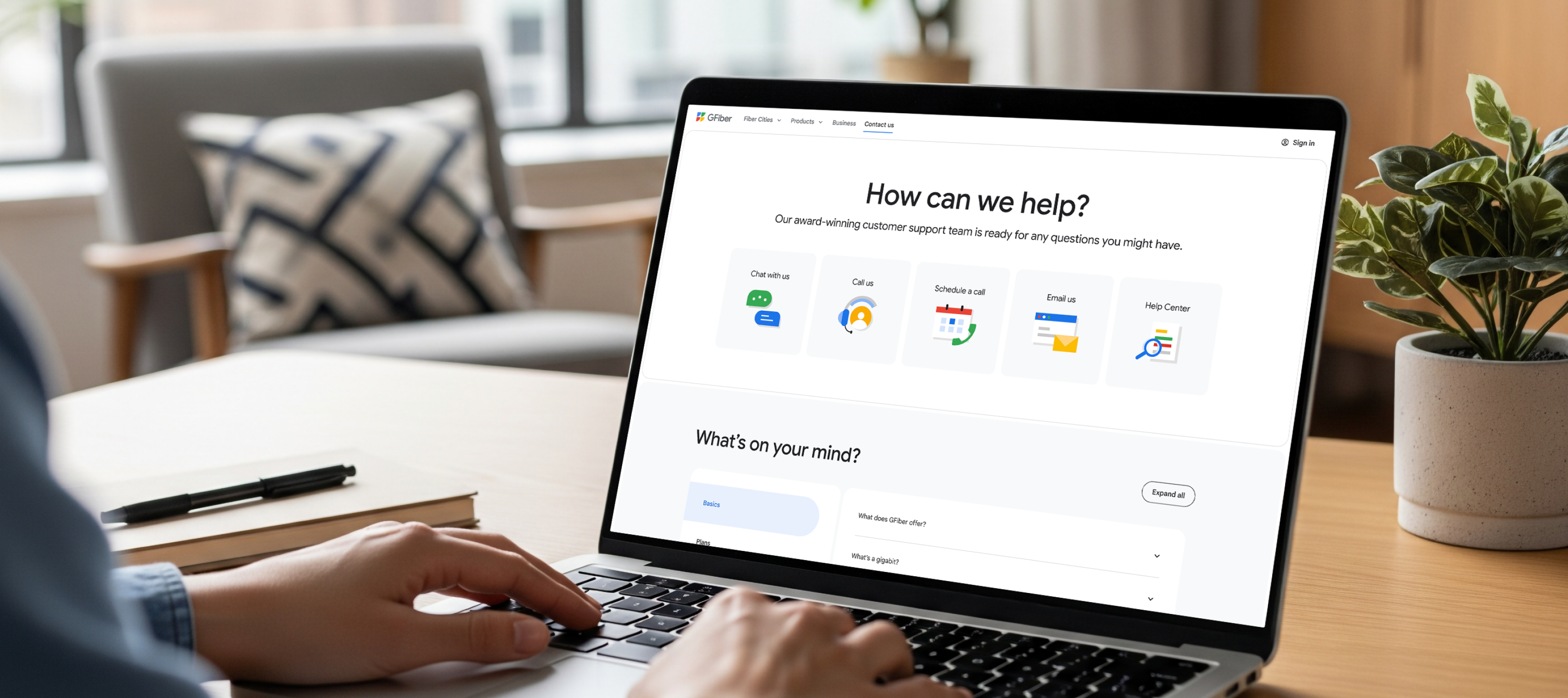
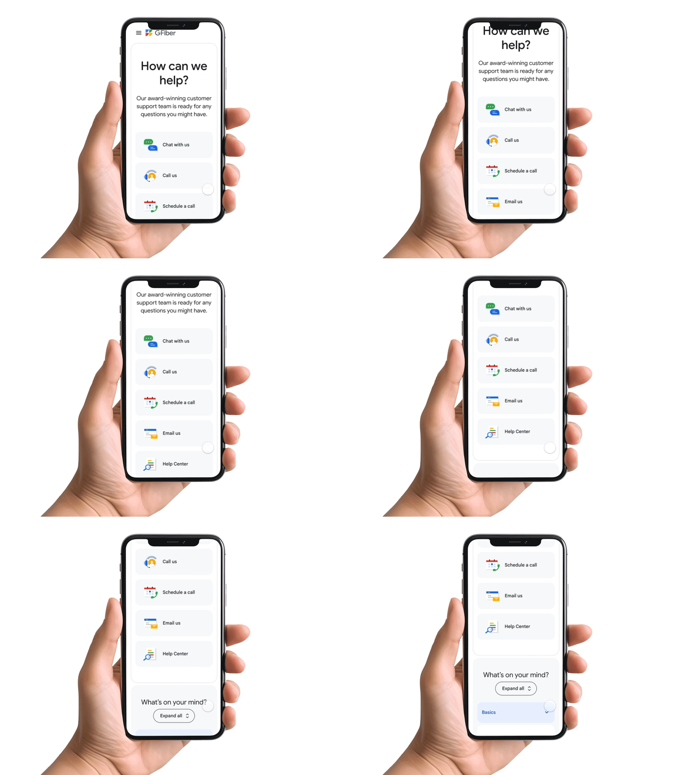
The GFiber Support page is a critical touchpoint for our customers. However, the legacy contact cards relied on static, outdated iconography and jarring hover states that lacked the premium feel of our brand. The UI felt disconnected, failing to guide the user effectively during their moment of need.
My goal was to elevate the support experience by redesigning the visual language and introducing purposeful micro-interactions. By evolving the static icons into a cohesive illustration system and layering in subtle, meaningful motion, I transformed these cards from purely functional UI into a delightful, and responsive interface.
Process
Auditing the experience
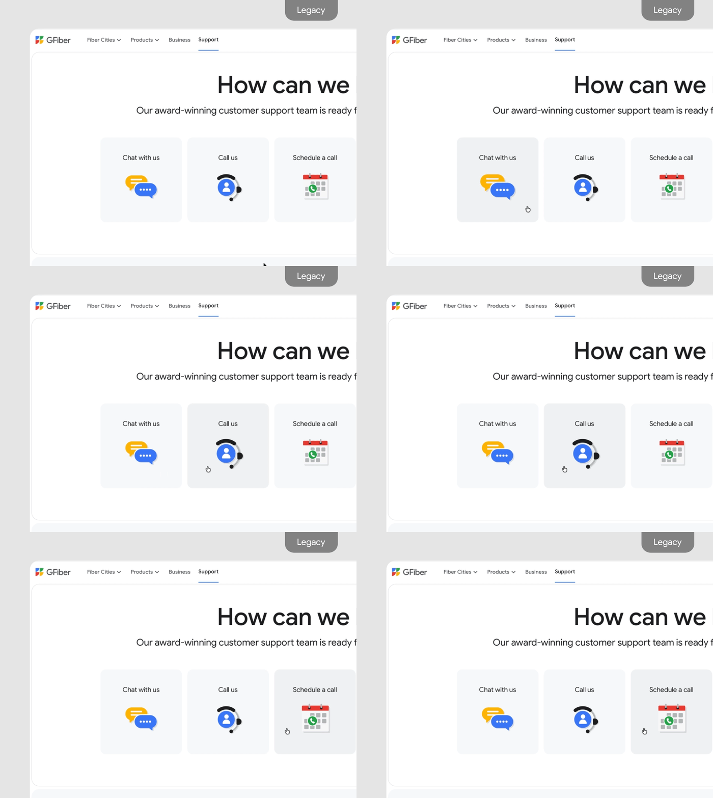
The legacy contact cards were purely functional, but they suffered from two primary issues: inconsistent brand identity and poor interaction quality. The static icons felt disconnected from our premium aesthetic, and the hover states relied on an abrupt, non-eased scale that felt jarring rather than responsive. My objective was to modernize the interface to feel cohesive and intentional.
Iconography: Systemic Consistency
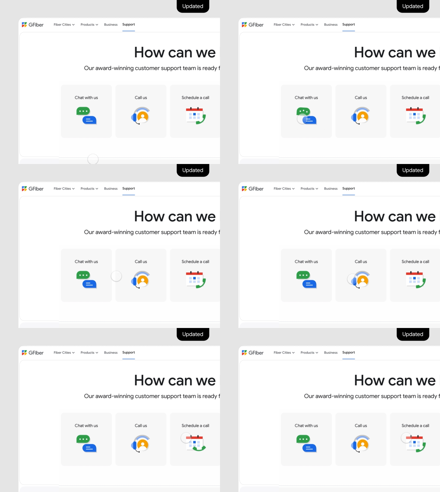
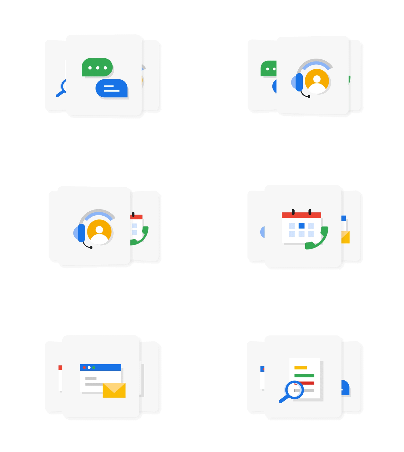
To create a unified visual language, I evolved the support icons to match the design system established during the Wi-Fi 7 launch. Using a theory-driven approach, I prioritized Shape as the primary element, with Line and Depth serving as secondary details. This ensured that the support portal feels like an extension of the broader Google Fiber ecosystem, rather than a fragmented experience.
Micro-Interaction
Because these icons are more illustrative than standard UI symbols, I had the opportunity to inject a higher level of personality into the interaction. However, "personality" still requires structural discipline.
Rather than creating bespoke, isolated animations, I utilized the MD3 Emphasized easing curve. By leveraging established Material Design standards, I ensured the motion remains consistent with the rest of our product suite, making it easier for Engineering to implement and easier for future designers to scale.
Conclusion
This project moved beyond simple asset updates. By establishing a shared visual and motion language across the Wi-Fi 7 launch and the Support portal, I helped reduce design fragmentation. This systematic approach ensures that as our product grows, the Google Fiber experience remains polished, consistent, and premium—regardless of which surface the user is on.