Type Design
Introduction
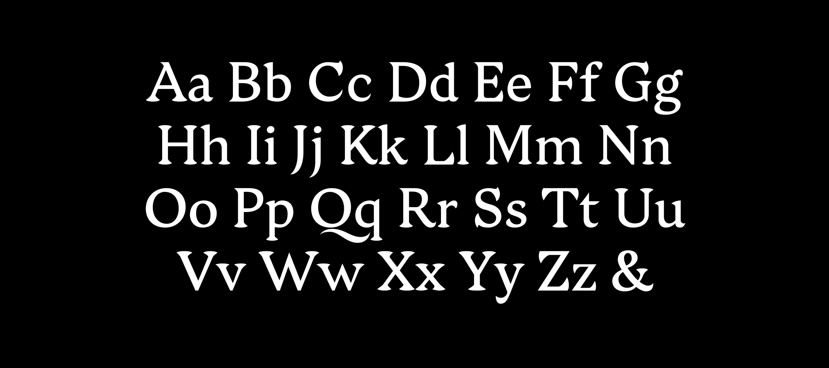
Typography is the foundation of all visual communication, yet creating a typeface requires a rare balance of technical discipline and artistic intuition. During the Type@Cooper Winter Intensive, I developed Marathon Zen—a translation-contrast typeface designed to reconcile the paradox of intense physical strain and meditative stillness.
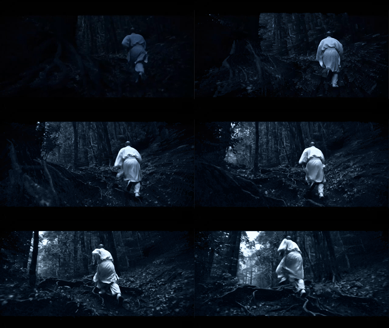
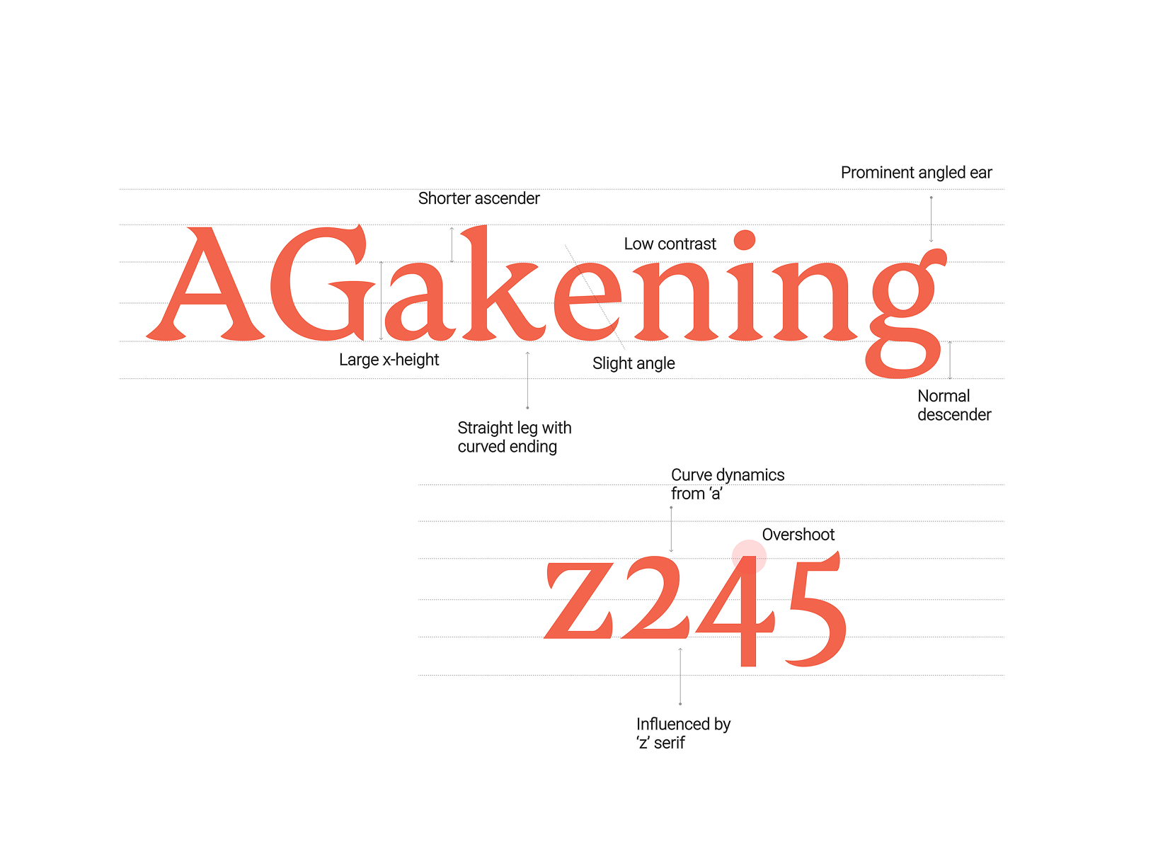
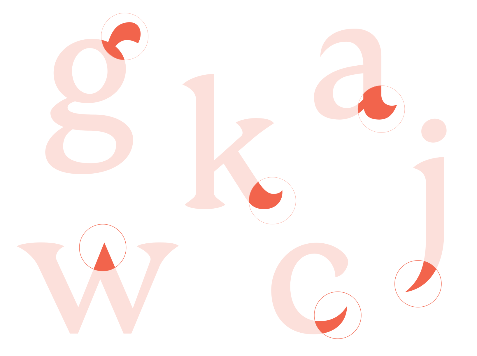
Inspired by the Japanese running monks (Kaihōgyō), the typeface embodies a duality: soft, circular bowls contrasted with abrupt, blade-like terminals. This project served as my primary submission for the 2023 Malee Scholarship, where I was honored to be named a finalist—an international recognition supported by Sharp Type Co. that champions underrepresented voices in typography.
Process
The Concept
I began by exploring the tension between movement and stillness. I wanted to capture the energy of a runner pushing their body to the limit while maintaining an unwavering mental focus. I visualized this through the letterforms: the stroke starts as a soft, rhythmic movement, but ends with a sharp, decisive cut.
Letterform Construction
Refinement & Iteration
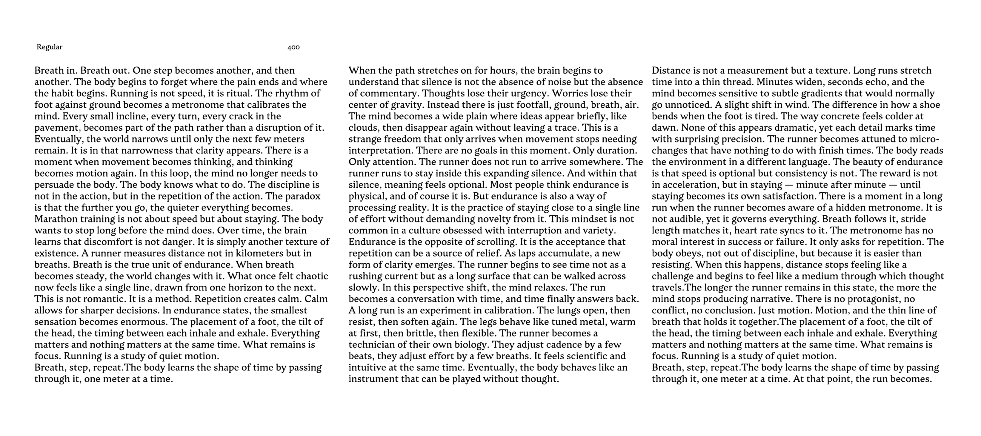
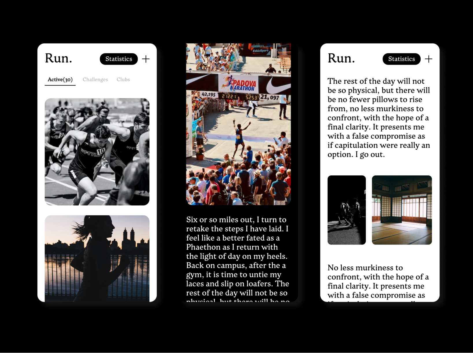
Type design is an exercise in microscopic adjustments. Throughout the Type@Cooper intensive, I iterated on the spacing, kerning, and weight balance to ensure that the typeface wasn't just a display piece, but a functional tool for continuous reading.

Conclusion
Marathon Zen represents my commitment to the craft of type design. Being named a Malee Scholarship finalist was a significant milestone, reinforcing my belief that the voices of underrepresented designers are vital to the future of typography. This typeface stands as a testament to my ability to translate complex conceptual narratives—like the spirit of a running monk—into functional, readable systems for digital and print media.